The design industry is rapidly changing with each passing year. If you go back to just five years in the past, you will notice how much our industry evolved from then trending flat designs, minimalism, fancy typography, and responsiveness. Every year comes with trending styles that better user experience. Like every year, this year also will bring lots of fresh changes that will rock the designing community.
Today I am going to talk about one such trend – Glassmorphism, which has the potential to be the most trending style of the year (or maybe earlier years of this decade).
Quick Summary:
- Glassmorphism creates a frosted glass effect.
- It uses low opacity, blurred layers on colorful backgrounds.
- Learn easy steps for Photoshop and Adobe Illustrator.
- Key steps involve blurring, adjusting fill/opacity, and adding strokes.
Table of Contents
What is Glassmorphism?
Glassmorphism is an effect simulating glass-like foreground. In simple words, it is a light or dark layer with low opacity, placed on top of the colorful (often gradient) background to achieve the frosted glass effect. This effect helps users determine the hierarchy of elements and gives a more vertical appearance.
Unlike it sounds, achieving this effect is super easy. Here I am gonna teach you how to achieve this effect in Photoshop and Adobe Illustrator.
Photoshop
Step 1:
Create an artboard and fill it with a grey color.

Step 2:
Start with the basic shape.
Give it a white color and 50px Radius.
Step 3:
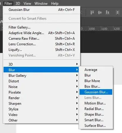
Select shape layer and go to > filter > blur > gaussian blur.
Step 4:
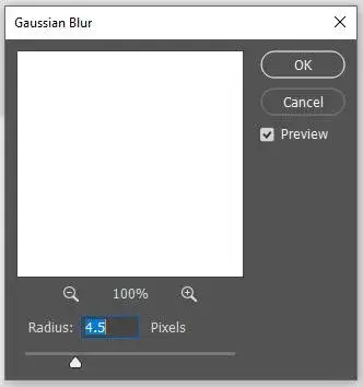
Add Radius amount around 4 to 5.
Here I am setting it for 4.5.
Step 5:
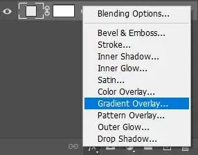
Now add gradient background so the effect can be clearly visible.
To do so, go to the fx > gradient overlay.
Step 6:
Choose your preferred colors.
Here I’ve used purple and blue.
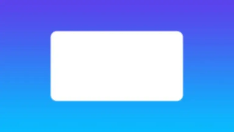
Step 7:
The layer will be plain white. You won’t see anything right now.
Select the white layer and decrease fill to around 40.
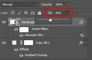
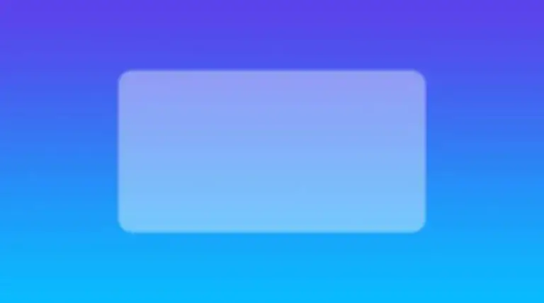
Step 8:
To make it more realistic, go to fx > stroke.
Add stroke as shown in the image.
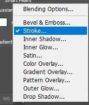
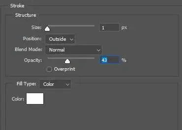
Now you will see the difference.
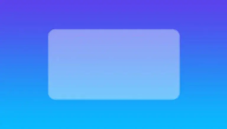
Congratulations! You’ve just applied the glassmorphism effect in Photoshop.
Now let’s do it in Adobe Illustrator.
How Much Will Website Design Cost?
Get an instant, personalized cost estimate for your your industry website. No guesswork — real numbers based on your type, pages, and features.
Adobe Illustrator
Step 1:
Create an artboard with a size you prefer.
Here I have created it with 4000 x 2000 px.
Step 2:
Create a same-sized rectangle and fill it with gradient colors.
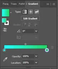
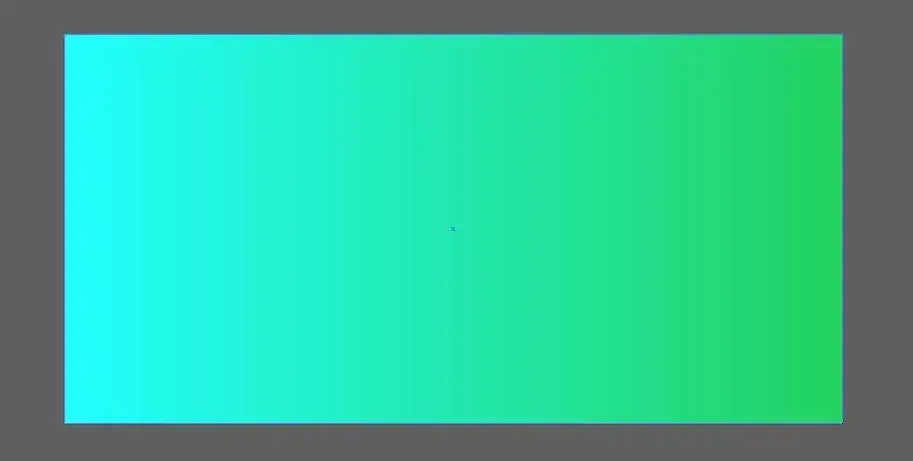
Step 3:
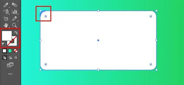
Now create a new shape with white fill and no stroke.
Add some border-radius to it.
Step 4:
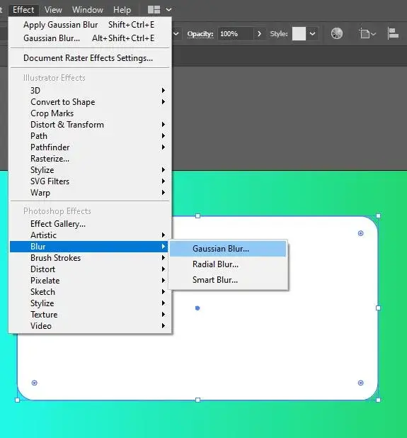
Click on Effect menu > go to Blur > Gaussian Blur.
Step 5:
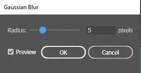
Apply 5px radius to its corners and click ok.
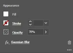
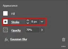
Go to the Appearance panel and decrease the opacity to 70%.
Step 6:
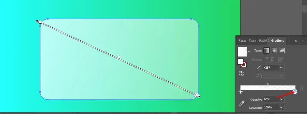
Now add a white to white gradient to the shape and decrease the opacity of one color by 60%.
Add 8px white stroke to make it more realistic.
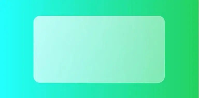
And your glassmorphism effect is ready.
Wrapping up
What are your thoughts on Glassmorphism? Will it last longer than a year? or some other trend will replace it? Do let us know your opinion about this in the comment section below and don’t forget to share this article with your designing enthusiast friends.
If you are looking for a software firm to create your business website or mobile app, your search ends here. We build affordable and robust software solutions for businesses to digitally thrive on. Contact us to get a quote. You can mail us at [email protected] or WhatsApp us on +91 95 37 84 38 39.
