
16 min read

Searching for news website examples can leave you with dozens of screenshots but few answers about what makes a design work. A large publisher may have a striking homepage, yet its layout could depend on editorial teams, technology and resources that a smaller publication does not have.
The useful approach is to study design patterns rather than copy entire websites. Look at how each layout presents important stories, helps readers explore topics, handles advertising and supports reading on mobile devices.
This guide examines examples worth studying, explains the decisions behind common homepage and navigation patterns, and explores how to balance monetisation with readability. You will also get practical ideas for turning inspiration into a design brief that fits your publication.
Table of Contents
- What Do the Best News Websites Have in Common?
- Which News Website Examples Are Worth Studying?
- How to study each example
- How Should a News Homepage and Breaking-News Layout Work?
- Homepage modules and their purpose
- Which Navigation and Content-Discovery Patterns Work?
- How Do You Balance Ads and Subscriptions With Reading?
- Metered and lead-in paywalls
- What Do Mobile, Speed and Accessibility Demand?
- Design Ideas for Building a Modern News Portal
- Example: a small local news website
- How Do You Know Your Current News Site Design Is Falling Behind?
- Why Choose Qrolic
- Our Web Services for News Portal Businesses
- Conclusion
- What is the best layout for a news website?
- What should be on a news website homepage?
- How many ads are too many on a news site?
- Should a news website have a paywall?
- Which fonts and sizes work best for news reading?
- How do I make a news website accessible?
- What makes news website examples useful for a redesign?
- What should I prepare before asking a designer to build a news portal?
What Do the Best News Websites Have in Common?
A good news website helps readers understand what matters and find the information they want without unnecessary effort. It does not need to look minimal or display only a few headlines. A busy homepage can still work when its sections have a clear order and readers can distinguish the main story from supporting content.
Use these principles to evaluate news website examples before deciding which ideas to adopt.
- Clear hierarchy: Give the lead story enough visual prominence to establish its importance. Supporting stories should remain easy to scan.
- Fast access to important news: Readers should find breaking coverage, the latest updates and major sections without navigating through several layers.
- Readable typography: Use text sizes, spacing and line lengths that support comfortable reading across devices.
- Predictable navigation: Keep section names familiar and make search, topic hubs and regional options easy to locate.
- Controlled advertising: Ads should have defined spaces that do not interrupt paragraphs or unexpectedly move content.
- Visible trust signals: Display useful information such as publication dates, update times and author details where relevant.
- Stable pages: Images, advertisements and other modules should not cause the content to jump while a reader is using the page.
- Consistent presentation: Article pages, section pages and the homepage should feel like parts of the same publication.
A useful test is to open a homepage and ask three questions: Can a reader identify the main story? Can they find their preferred section? Can they start reading without closing several interruptions?
For a publisher planning a tailored build, Qrolic’s planned news portal website design and development page is a relevant service destination. Confirm that the supplied page is available before publishing the link.
Which News Website Examples Are Worth Studying?
Large publishers offer useful reference points, but each should be examined for a specific design decision. Their layouts are not universal templates. A pattern that works for a publication with multiple editorial desks may create unnecessary complexity for a small local newsroom.
The following sites are candidates to inspect, not a ranking. Their live layouts, regional editions and subscription prompts can change, so verify each site at the time of writing before describing its current design.
| Site to study | Pattern to investigate | What a smaller publisher can adapt | What may be difficult to copy |
| BBC News | Topic and regional organisation | Clear section labels and routes to relevant coverage | Supporting many topics, regions and language editions |
| The Guardian | Editorial presentation and section structure | Consistent typography and recognisable section hubs | A broad editorial operation and extensive content catalogue |
| The New York Times | Homepage hierarchy and subscription experience | A clear distinction between lead and supporting stories | A subscription experience built around an established publication |
| The Washington Post | Story prioritisation and subscription prompts | Considered placement of account and subscription messages | The editorial and commercial resources behind a large publisher |
| Reuters | News discovery and story access | Direct routes to important coverage | A presentation model shaped by a broad news operation |
| Al Jazeera | Regional coverage and live reporting | Clear routes to regional and developing stories | The work required to maintain extensive live and regional coverage |
| Axios | Scannable news presentation | Short, clearly structured content blocks | Applying one editorial format to every story type |
| A local or regional-language publisher | Community coverage and language access | Local section labels, familiar terminology and suitable script typography | Maintaining consistent presentation across multiple languages |
How to study each example
Do not judge a site only by its first screen. Explore a section page, an article page and its mobile version. Then assess the same design questions for every example.
- Hierarchy: Which story receives the strongest emphasis, and how are secondary stories arranged?
- Navigation: Can readers reach sections, regional editions and search easily?
- Reading experience: Is the article comfortable to read, or do prompts and advertisements interrupt it?
- Commercial design: Where do subscription messages, registration requests and advertisements appear?
- Mobile experience: Does the content order remain logical on a smaller screen?
- Accessibility: Can readers understand labels, use controls and navigate without relying only on colour or a mouse?
For an Indian publisher, include at least one publication serving the intended audience. A national English-language site may not provide the right reference for a regional-language portal. Check how the selected publication handles script rendering, text spacing, language switching and regional navigation.
The main lesson is to borrow individual decisions, not complete identities. A small publication might adapt a clear section menu from one site and a readable article layout from another. It does not need to reproduce a global publisher’s entire homepage.
Plan a News Website That Fits Your Publication
Bring your design references and publishing requirements to a project discussion about the next steps for your news portal.


How Should a News Homepage and Breaking-News Layout Work?
A news homepage needs to help readers move from the most important coverage to the topics they follow. Each module should have a clear purpose. Adding more modules without deciding their order can make the page harder to scan.
A practical homepage can use the following structure:
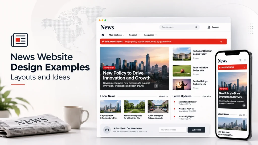
This is a starting structure, not a fixed template. A specialist publication may give its main topic more space, while a local portal may prioritise regional coverage.
Homepage modules and their purpose
- Header: Establishes the publication’s identity and provides access to search and account options.
- Section navigation: Helps readers move between major coverage areas.
- Breaking-news strip: Highlights a developing story and links to the full coverage.
- Lead story: Gives the most prominent position to the story the editorial team wants readers to notice first.
- Supporting stories: Provide additional coverage without competing equally with the lead.
- Topic blocks: Organise stories by subject, region or audience interest.
- Latest or most-read module: Gives readers another route into current or popular coverage.
- Newsletter prompt: Offers a way to follow future coverage without interrupting every article.
- Footer: Provides access to publication information and secondary navigation.
A breaking-news module should distinguish a new update from an older headline. Show a meaningful update time when the story changes, and link to the full report or live coverage. Avoid making every routine article look urgent.
Carousels also need care. If important stories appear only after a reader clicks through slides, some visitors may never discover them. A visible story list often provides a more direct route to coverage.
For a fuller feature checklist behind these layout decisions, see the guide to essential news portal website features.
Which Navigation and Content-Discovery Patterns Work?
Readers arrive with different goals. Some want the latest headlines, while others follow a particular topic, location or journalist. Navigation should support these journeys without making the homepage feel like a directory.
Choose patterns based on the publication’s content and audience.
- Simple section menu: Works well for a publication with a small number of clear categories. It keeps the main navigation easy to scan.
- Mega-menu: Can help a large publication expose several related sections. Use it only when the extra choices make discovery easier.
- Search: Helps readers find a known topic, person or story. Give the search control a clear label and make it easy to access on mobile.
- Topic hubs: Group coverage around subjects that receive regular reporting. They give readers a route to more than one article.
- Tags: Connect related stories across sections. Keep tag names consistent so readers do not encounter several labels for the same subject.
- Latest news: Helps readers browse by publication or update time.
- Most-read stories: Offers another discovery route, but should not replace editorial judgement about what deserves prominence.
- Related stories: Connect an article to relevant background or follow-up coverage.
- Regional and language switchers: Help readers reach coverage that matches their location or preferred language.
- Mobile navigation: Keep the most important sections and search accessible without requiring several taps.
A multi-section regional portal may need regional and language navigation near the top of the experience. A niche trade publication may need fewer sections but stronger topic hubs.
The goal is not to expose every category at once. It is to give readers a clear route to the next relevant story.
How Do You Balance Ads and Subscriptions With Reading?
Advertising and subscriptions can support a news business, but their placement affects the reading experience. A page with many visible placements may feel commercially active while making stories harder to follow.
Treat each advertisement and prompt as part of the layout, not as an element added after the design is complete.
| Element | Possible reader impact | Safer design approach |
| Display ads | Interrupt reading if they break up paragraphs or dominate the screen | Define placement and preserve a readable article column |
| In-content ads | Can make long articles feel fragmented | Use consistent spacing and avoid placing ads too close to headings |
| Video ads | May distract readers or delay access to content | Avoid unexpected playback and give readers control |
| Subscription prompts | Can interrupt a reader who has not understood the offer | Explain the value clearly and avoid repeated prompts |
| Registration requests | Add friction before readers can continue | Explain why registration is needed and keep the process understandable |
| Newsletter prompts | Can interrupt an article when they appear too early | Place them at natural reading points or near the end |
| Consent banners | Can cover important content if oversized | Use clear language and a layout that leaves the page usable |
Metered and lead-in paywalls
A metered approach lets readers access a set amount of content before asking them to subscribe. A lead-in approach allows readers to begin an article before restricting the remaining content.
Both approaches need clear communication. Readers should understand what they can access, what requires a subscription and what action they can take next.
Google’s flexible sampling guidance has described metering and lead-in as approaches publishers can consider. Publishers should check current Google Search Central documentation before implementing paywall-related structured data. In plain terms, that markup identifies which parts of an article are available without a subscription. It does not guarantee search visibility.
Mobile interstitials also require careful treatment. An intrusive prompt that blocks the main content can frustrate readers. Google has described exceptions for certain legal obligations, such as cookie or age verification, and login dialogs on content that is not publicly indexable. Easily dismissed banners that use reasonable screen space are a different experience from full-screen interruptions.
The practical test is simple: can readers understand and access the content without repeatedly dismissing prompts?
What Do Mobile, Speed and Accessibility Demand?
Many readers will encounter a news site on a phone. A desktop layout that simply shrinks to fit a smaller screen may leave important controls difficult to use and headlines hard to scan.
Check these areas during design and testing:
- Responsive layout: Make sure headlines, images, navigation and article content adapt to narrow screens.
- Tap targets: Keep menus, links and buttons easy to select without accidental taps.
- Readable text: Check font size, line spacing and contrast on real devices.
- Stable loading: Reserve appropriate space for images and advertisements so content does not shift unexpectedly.
- Image handling: Use images that fit their intended spaces without making readers wait unnecessarily.
- Keyboard access: Test whether menus, search controls and other interactive elements work without a mouse.
- Screen-reader support: Check that controls have meaningful labels and that page structure communicates the content order.
- Dialog behaviour: Make sure subscription and consent dialogs can be opened, understood and dismissed appropriately.
- Language support: Test the actual scripts used by the publication. Regional-language layouts may need different font choices and spacing from English pages.
Accessibility should be part of the design brief rather than a final visual check. Confirm the applicable current accessibility standard and test the finished site against its relevant requirements before publication.
Design Ideas for Building a Modern News Portal
A modern news portal does not need to imitate a large media brand. It needs a layout that fits its readers, content volume, editorial workflow and business model.
Use this process to turn inspiration into a practical brief.
- Identify the main reader journeys. Decide whether visitors primarily look for breaking updates, local reporting, specialist coverage or opinion.
- Choose the homepage priorities. Select the stories and sections that deserve the most visible positions.
- Set navigation rules. Define the main categories, topic hubs, search behaviour and any regional or language options.
- Choose a commercial approach. Decide where advertisements, newsletter prompts, registration and subscription messages belong.
- Plan reusable page layouts. Define how article pages, section pages and special coverage pages should work together.
- Design for editors. Make sure the team can maintain headlines, images, updates and topic sections without creating inconsistent pages.
- Test on real devices. Review the homepage and article pages on phones, tablets and desktop screens before finalising the design.
Example: a small local news website
Imagine a local publication with a small editorial team and regular coverage of community events, public services, education and local business.
It may need a simple homepage with a prominent local lead story, a breaking-news strip, a few topic sections and a clear route to older coverage. A large mega-menu, several rotating carousels and repeated subscription prompts may add more work than value.
The team could begin with a small set of reusable layouts and expand when its coverage requires more sections. That approach gives editors a manageable structure while helping readers find local stories.
Once the design direction is clear, the guide to building a news portal website can help you consider the wider build process.
If you have a design direction but are unsure what your team can realistically build, a scoping conversation can help clarify the requirements and priorities.
Discuss Your News Portal Project
Share your intended audience, editorial structure and preferred design patterns to discuss the scope of your project.
How Do You Know Your Current News Site Design Is Falling Behind?
A redesign may be worth considering when the current experience repeatedly makes it harder for readers or editors to do their work.
Look for these warning signs:
- Important stories are hard to find: The homepage gives too many modules equal prominence.
- Mobile pages feel difficult to use: Navigation, headlines or controls require unnecessary effort.
- Ads disrupt reading: Prompts and placements cover content or make the page unstable.
- Sections feel disconnected: Readers cannot easily move between related topics and articles.
- The site is difficult to maintain: Editors struggle to keep page layouts and story presentation consistent.
- The design no longer fits the publication: New sections, languages or revenue models have outgrown the original structure.
These are useful starting points for a review, not proof that a complete rebuild is necessary. For a more detailed diagnostic, review these signs your news portal website is outdated.
Why Choose Qrolic
Qrolic Technologies is a web design and development agency with a WordPress focus, so its strongest relevant perspective is on WordPress-based website projects. Publishers considering a news portal design or development project can Contact Qrolic to discuss their requirements and the scope of a possible build.
Our Web Services for News Portal Businesses
- News Portal Website Design and Development Services: This service is intended for publishers who need a custom-designed and developed news portal. It is relevant when a team has defined its editorial needs and wants to translate its design direction into a working website.
Conclusion
Useful news website examples show how publishers organise stories, support discovery and balance commercial elements with reading. The right design is not necessarily the busiest or most visually impressive. It is the one that fits your audience, editorial team and publishing model.
Study individual patterns, test them on mobile and choose a structure your team can maintain. A clear design brief gives your designer and developer a practical starting point.
Turn Your Design Ideas Into a Clear Project Plan
Discuss your preferred layouts, reader journeys and publishing requirements before deciding what your news portal needs.
What is the best layout for a news website?
A useful news website layout gives the lead story clear prominence, organises supporting stories into recognisable sections and provides direct access to breaking news, search and navigation. The right structure depends on the publication’s audience and content.
What should be on a news website homepage?
A homepage commonly includes the publication’s identity, section navigation, a lead story, supporting stories, breaking-news updates, topic sections and links to recent coverage. It may also include newsletter or subscription prompts and a footer with secondary information.
How many ads are too many on a news site?
There is no single number that suits every publication. Review whether ads interrupt paragraphs, cover content, cause unexpected layout movement or make navigation difficult. The goal is to support advertising without making stories difficult to read.
Should a news website have a paywall?
A paywall may suit a publication with content readers are willing to pay to access. Consider whether metered access or a lead-in approach fits the publication’s content and audience. Explain subscription requirements clearly before restricting an article.
Which fonts and sizes work best for news reading?
Choose fonts and text sizes that remain readable across desktop and mobile screens. Check line spacing, contrast and headline wrapping. For regional-language publications, test the actual scripts and font rendering used by the audience.
How do I make a news website accessible?
Start with readable text, sufficient contrast, meaningful control labels and keyboard-accessible navigation. Test dialogs, menus and forms, and check that screen readers can understand the page structure. Confirm the applicable accessibility standard before launch.
What makes news website examples useful for a redesign?
Useful examples show specific patterns you can evaluate, such as homepage hierarchy, navigation, article readability and subscription prompts. Compare them against your team’s resources instead of copying a complete design from a larger publisher.
What should I prepare before asking a designer to build a news portal?
Prepare your target audience, main content sections, editorial workflow, revenue approach and preferred design references. Include examples of patterns you want to adopt and explain what your current site does not support.
Enjoying our content?